
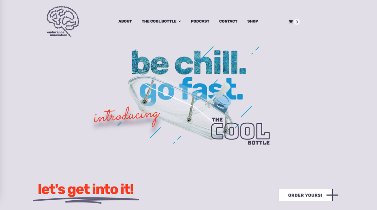
The Bottle “Sweater”
The shape was set, but the EI team need a design that would be easy to read by people looking at the rider using the bottle as well as something visually interesting for the rider themselves to look at. I conceived the idea of using an icy pattern on the bottle cover to give a visual cue to riders that they felt cool (the point of the bottle), whilst also being a subtle backdrop for the text to stand out against.

First design drafts using an early bottle and cover prototype

A later iteration, ironing out positioning of text and pattern


